UX research | Product design
EWA Employer Dashboard - A strategic partner for Orgs
Overview
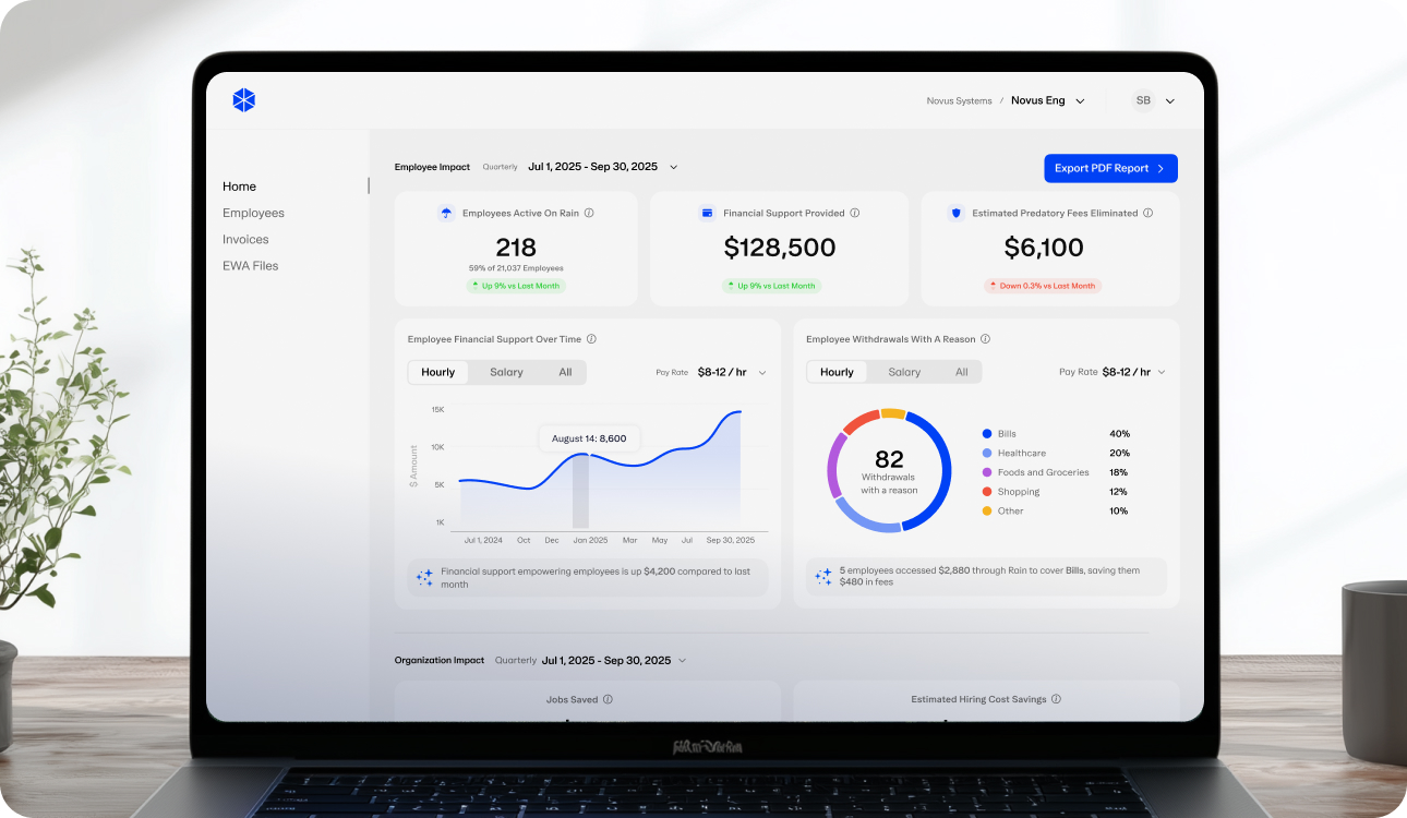
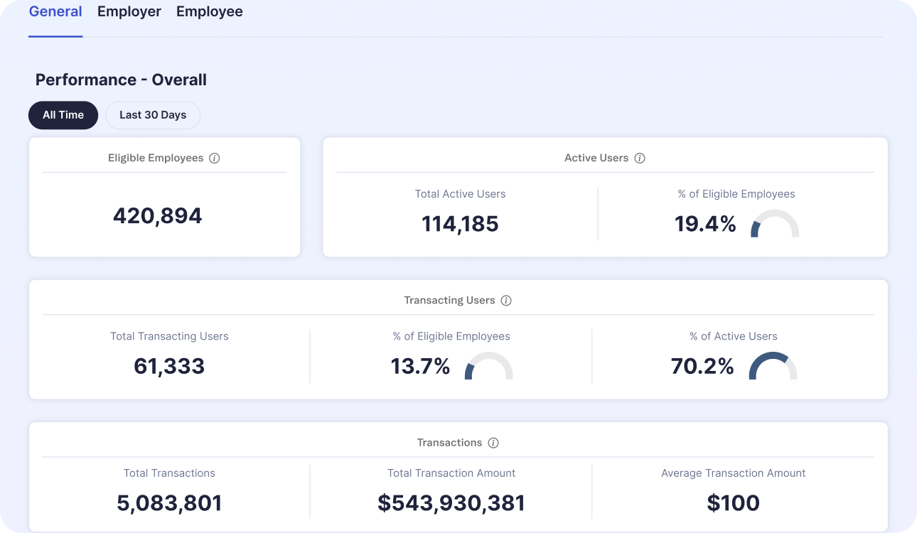
The original dashboard was static, just org-wide numbers with no story attached. It showed usage, not impact. Employers wanted one place to see Rain's real effect on their people, exportable enough to share up the chain. Rain wanted the same dashboard to turn engaged employers into champions. Over one quarter, I led the redesign that made both true, shifting the dashboard from a numbers dump into a decision tool that positions Rain as a strategic partner, not just a benefit line item.
Approach
I partnered with the Dashboard PM and the EVP on a research-driven redesign. We interviewed 15 employers across payroll, HR, and benefits roles before committing to a direction. A pattern showed up that goes beyond Rain: EWA providers lean on claims like "reduced turnover by X%," numbers employers can't verify and don't fully trust. That distrust was quietly working against adoption.
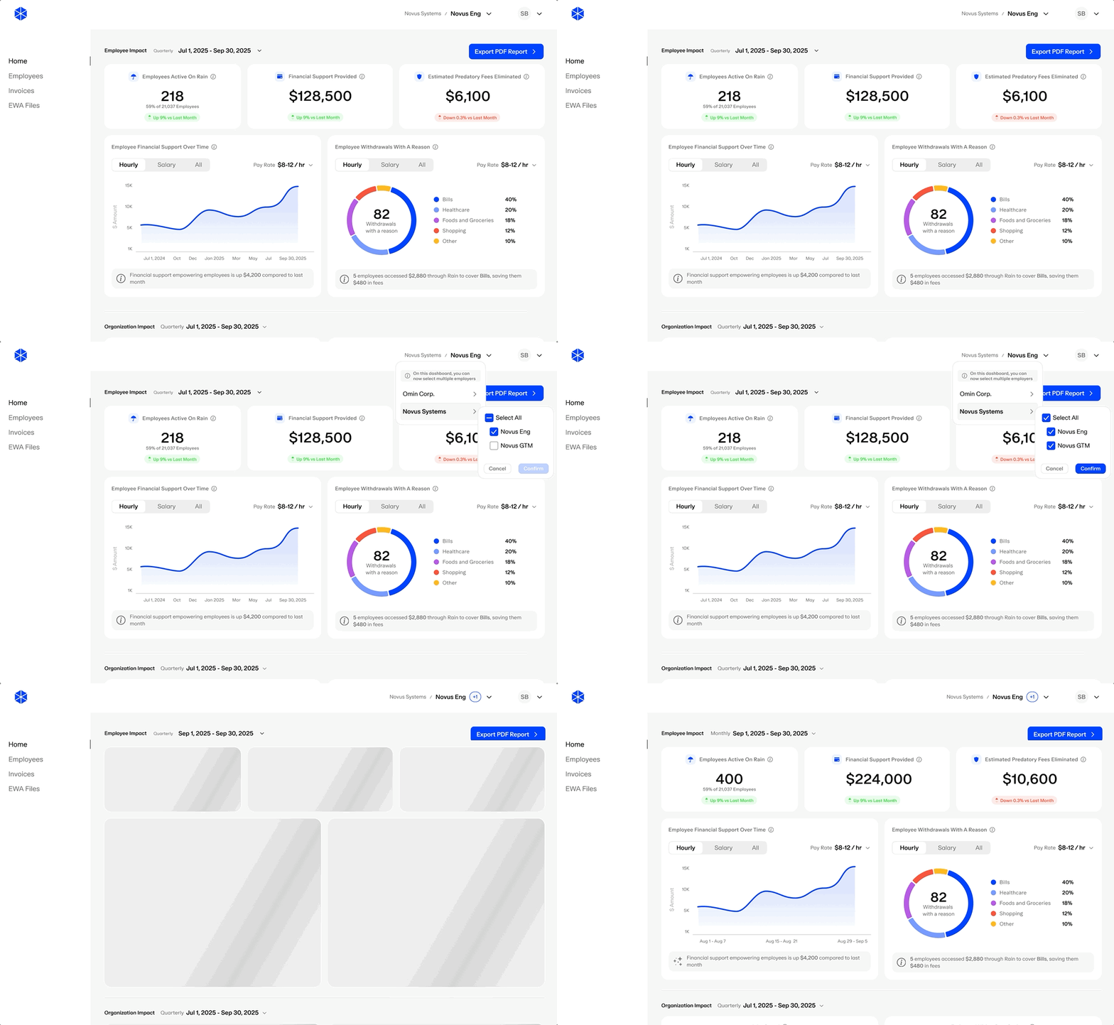
The whole product had been built on the opposite assumption, that employers respond to the business case, so lead with Jobs Saved and Hiring Cost Savings. Our research said otherwise. What actually landed was specific, human impact. I pushed to invert the hierarchy, Employee Impact metrics sit in front, Org Impact stays one layer back, still there, just not competing for attention. Each layer got its own visibility, visualization type and reach, so the priority held on its own instead of depending on someone remembering to keep it that way.
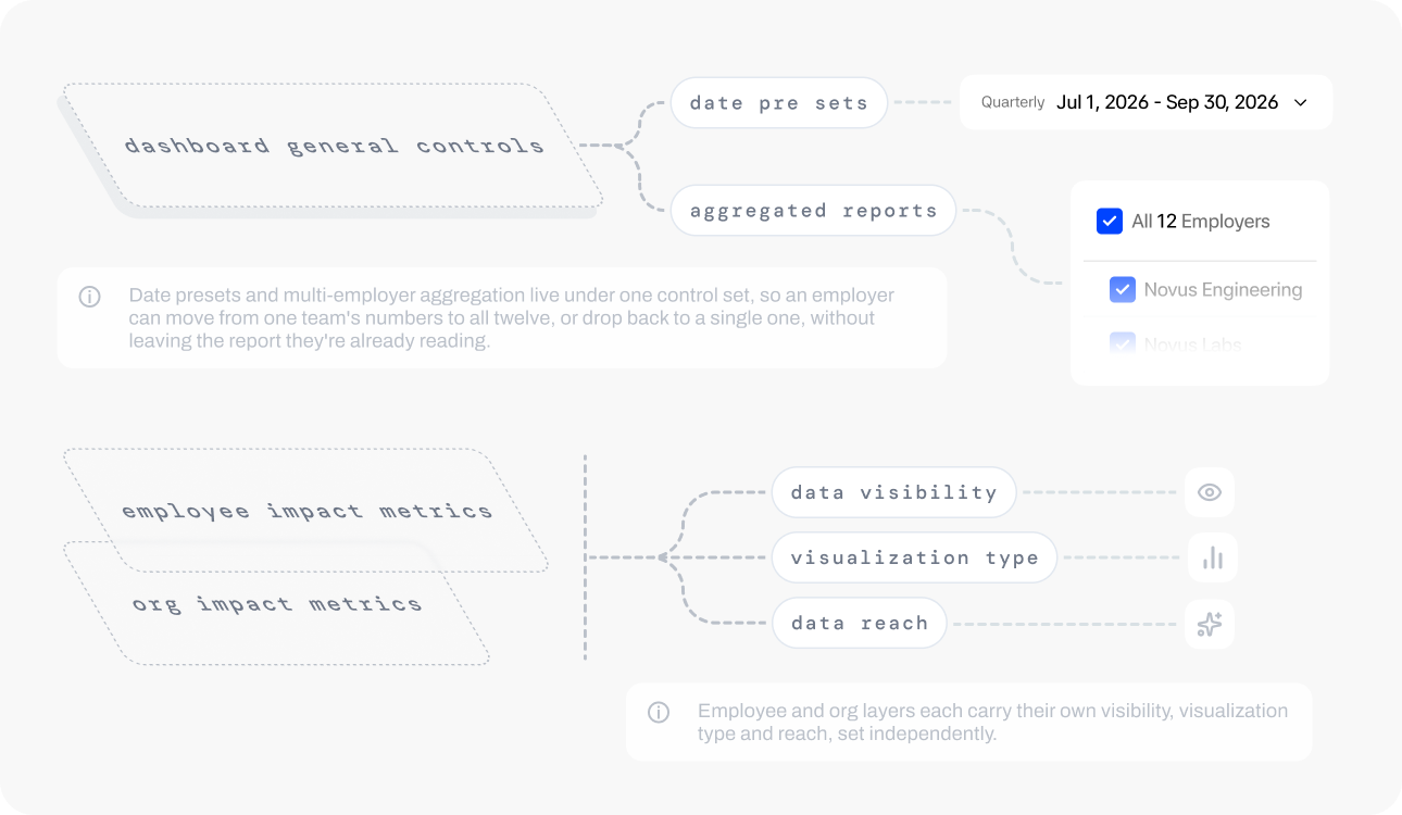
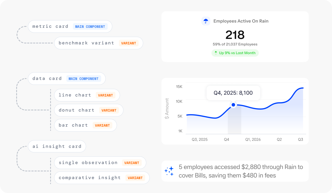
Each card had to flex on its own terms. A data card can render as a line, donut or bar depending on what the number needs to say. A metric card can show a flat total or benchmark it against the wider group. An insight card can surface a single observation or stretch into a comparison against last period. Same components, different shape and different range, depending on what the data actually calls for.
Outcome
- The dashboard leads with Employee Impact: financial support provided, predatory fees avoided, why people are actually using Rain, before any org-level number shows up. The order is the strategy, made visible.
- Rain users show measurably lower turnover and more hours worked per month than non-users, baked right into the report employers export and send to leadership.
- The redesign replaced the original as Rain's default employer-facing view and is still the one in use today.